When I last wrote about precious metals in October of last year, I focused primarily on what they (especially gold) can tell us about other commodity and asset classes. But, I did assign gold “a ‘Hold’ rating, because I expect continued weakness in commodities” even though “the metal also has the potential to significantly outperform other commodities and global stock indices.” Since then, precious metals have outperformed all other major asset classes including long-term Treasuries, equities, and commodities, as illustrated in the following chart.
Chart A. Precious metals have outperformed other asset classes since October. (Stockcharts.com)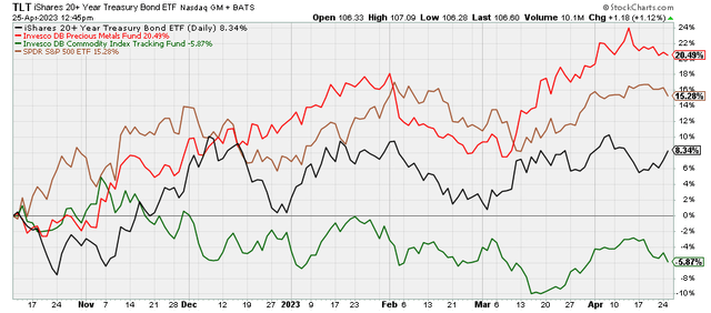
In this article, I am going to argue why the outlook for precious metals has become more negative, even though I continue to believe that precious metals (particularly gold) are likely to outperform ‘risk assets’ like equities and commodities this year. And, I also intend to argue that they are likely to underperform long-term Treasuries. This thesis, simply stated, is that, against a cyclical disinflationary backdrop, precious metals have likely overextended themselves, especially relative to Treasuries, and now have more downside risk than upside risk.
Below, I will briefly review both my overall market outlook and the relationship precious metals have with other asset classes, and update where we are relative to that outlook. Most reliable indicators are pointing to a persistent cyclical slowdown, and precious metals are the only commodity class that has not gotten the message. But, their absolute and relative strength, illustrated in the chart above, is likely overdone and ripe for reversal.
First, let’s look at the cyclical slowdown.
The downcycle
As I have argued in previous articles about market cycles, commodity, corporate earnings, and bond yield momenta (Bing assures me this is the plural of momentum) tend to be both positively correlated with one another and with their own absolute levels. Momentum in copper, for example, is likely to be positively correlated with its own price levels and with momentum in earnings, other commodities, and Treasury yields. I call this momentum-cluster the “market cycle”, and earnings momentum seems to be at the center of this cycle. So, we can gauge the state of the market cycle by reviewing their respective momenta alongside one another.
There is probably no better pair of indicators of cyclical conditions (secular or long-term conditions have parallel sets of ‘rules’) than momentum in earnings and industrial metals. I have written in greater detail about my industrial metals outlook in June of last year and again in January of this year.
Chart B. Earnings and industrial metals cycles tend to be correlated with one another. (Robert Shiller data, World Bank)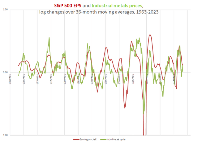
And, in August of last year and in February of this year, I talked about exhaustion in upward momentum in yields likely giving way to a cyclical bull market in Treasuries. And, that seems to be what is happening.
Chart C. Bond yield cycles also appear to have turned. (St Louis Fed)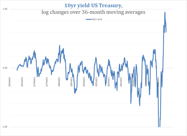
We could look at grains, agriculture commodities more generally, and energy, and we would see much the same.
What about equities, though? Equities are not especially cyclical. Historically equity momentum has often been inversely correlated with momentum in commodities, yields, and even earnings, especially during ‘ secular’ bull markets. We hear echoes of this history now in the claims that softening inflation and Fed pivots will be bullish for stocks. But, during ‘secular’ bear markets, equities tend to sync up with the market cycle.
Based on what appeared to be growing evidence of stocks entering such a ‘secular’ bear market, I argued in January of last year that we would likely see stocks come down with a decelerating market cycle. And, we have seen just that, at least thus far.
Chart D. The S&P 500 has also suffered, as equities begin to correlate with the market cycle. (St Louis Fed; Shiller data)
So, as of right now, the cycle remains in a general state of decline. But, how do we apply this to anticipating where precious metals are likely to go?
Precious metals in the market cycle
This is a problem, because precious metals lead the market cycle. This is something I have demonstrated in many of the articles linked to above, but also in the article on gold I linked to at the beginning of the present piece. Although the market cycle is predominantly characterized by correlations in momentum, there is also a progression to that cycle which is fairly reliable. In commodities, it looks something like the following chart.
Chart E. Commodity cycles have historically had a consistent rhythm with respect to one another. (Author)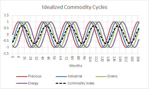
And, in terms of the larger market cycle, it looks something like this.
Chart F. Commodity cycles tend to have standard relationships with earnings and interest rates, as well. (Author)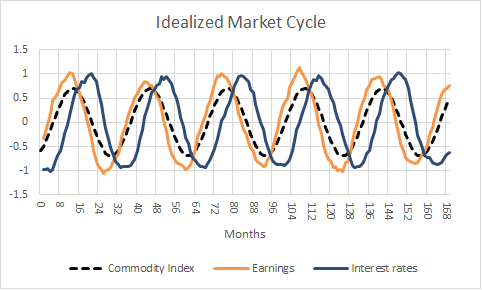
Precious metals, and particularly gold, run ahead of the pack. (This is true at the cyclical level of analysis; at the supercyclical level of analysis, precious metals tend to lag.)
This gives precious metals a powerful predictive capacity, but if precious metals are leading everybody else, who is leading precious metals?
Anticipating PM prices
Despite being the most ancient asset class, precious metals are perhaps the most difficult to understand. Ten years ago, I tried comparing the history of gold prices to conventional metrics (for example, the rate of consumer inflation or real yields) and found most of them unsatisfactory. Ten years later, I feel like my own alternative metrics have held up better, but only slightly.
My conclusion is that we have to use what scraps history has left us, and my argument is that most-but not all-of those scraps point to downward pressure on precious metals.
The Gibson Effect 2.0
First, there is what I call “Gibson’s Paradox 2.0” or the “Gibson Effect 2.0”. Gibson’s Paradox was the name that Keynes gave to the phenomenon of the positive correlation between prices, especially producer prices, and bond yields. Economic theory suggested that prices and yields should be inversely correlated-thus, the “paradox” first described by a banker by the name of Gibson. The Paradox later became the foundation of the notion that, under fiat monetary regimes, real gold prices are correlated with real interest rates, first propounded by Lawrence Summers and Robert Barsky in the paper “Gibson’s Paradox and the Gold Standard”. They argued, in fact, that this relationship between real gold prices and real interest rates is Gibson’s Paradox in modern garb.
I have tried to show that that is unlikely, that the relationship between primary commodity prices and yields is primarily “real” rather than monetary, and that that is evident in the correlation between real commodity prices and the earnings yield on equities going back to the 1870s. The following chart illustrates this relationship since 1960.
Chart G. Real commodity prices have been strongly correlated with the earnings yield as far back as the 1870s. (World Bank; Shiller data)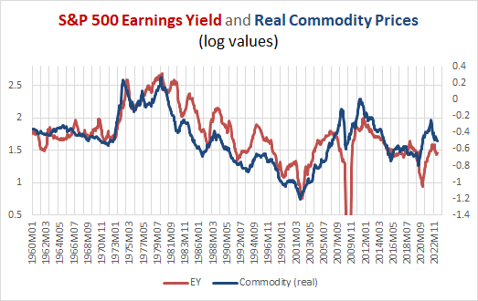
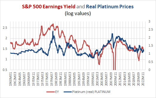
There are strong echoes of this in the precious metals. Look at the real prices of silver and platinum alongside the earnings yield on the S&P 500.
Chart H. Silver prices seem to follow the earnings yield, but have seem more rangebound. (World Bank; Shiller data) Chart I. Like silver, platinum prices seem rangebound. (World Bank; Shiller data)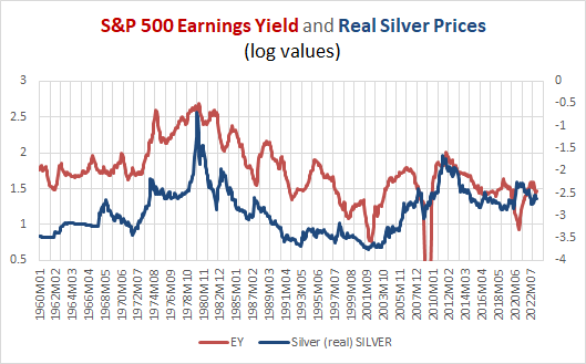
Then look at gold.
Chart J. Real gold prices appear to be less sensitive to the Gibson Effect than other commodities, including other PMs (World Bank; Shiller data)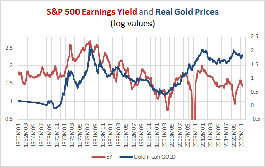
The key point here is that real commodity prices, over the long term, track quite closely to the earnings yield. Real platinum and silver prices also tend to track the earnings yield, but they have moved in a rangebound motion over the last sixty years while the yield has been in decline. Real gold prices, however, seem to keep moving up and to the right.
It seems to echo the Gibson Effect, albeit more faintly than other commodities, but there is something else apparently at work, as well. What drives this relationship between yields and real commodity prices is less a paradox than a baffling mystery, so the tendency of precious metals to depart from what is at least a stable statistical relationship is all the more confusing. But, it at least appears that as long as the earnings yield remains low, there is likely to be downward pressure even on precious metals prices.
Is the earnings yield likely to remain low? This is as easy as predicting PE ratios, and we are led into circular arguments. PE ratios are likely to remain high (and yields low) as long as commodity prices and inflation remain low.
The earnings yield and Kondratiev
What I have found is that, as with the conventional wisdom that surrounds the drivers of precious metals prices, the conventional wisdom about what drives commodity prices and yields is not well established empirically. As I have argued before, I can find very little evidence that even supply and demand drive commodity prices.
The only theory or model that seems to at least competently model the mechanisms at work are those first described by Nikolai Kondratiev and Joseph Schumpeter a century ago. Last year, in a series entitled “Conjunction & Disruption: Technology, War, And Asset Prices”, I found out that the relationships the two European economists described had remained surprisingly robust over the last century, and that the reason this has been overlooked is because of an overemphasis on the length of the “waves” or supercycles.
In brief, phases of innovation supercycles (from first creative burst all the way through market saturation) are strongly connected with changes in the earnings yield, real commodity prices, and global instability (as measured in global deaths in battle). The primary differences between my findings and those of Kondratiev and Schumpeter were that earnings yields are more important than bond yields, that real prices matter more than nominal prices, and that the focus of transformative innovations had moved from the producer side (under the gold standard) to the consumer side (under the fiat standard). Simultaneous with that transition from gold to fiat money was the transition from the 50-60 year supercycle to a 30-year supercycle. Thus, there have been decade-long bursts of commodity inflation, bear markets, and war occurring in the 1910s, 1940s, 1970s, and 2000s, and these are separated by consumer tech booms in cars and radios (in the 1920s), TV (in the 1950s), PCs (in the 1980s and 1990s), and smartphones (in the 2010s).
Moreover, I was able to link research on long-term sector rotations that I published here in 2021, with these supercyclical processes. Among other things, the combination of a ‘secular’ tech-sector equity boom with a simultaneous energy crash that is then followed by a cyclical energy shock is the classic conclusion of the primary saturation phase of an innovation supercycle, and that these booms always occur during the troughs in these new Kondratiev Waves (that is, in troughs in commodity prices, the earnings yield, consumer inflation, and global instability).
Innovation and standardization of a disruptive innovation has historically coincided with war, high commodity prices, and falling PEs. Mass adoption occurs in the two decades after, as PEs rise, commodity prices fall, and global political order stabilizes. Again, the tech booms occur as the saturation phase is concluding, even if it is likely that these booms are seeding the subsequent innovation supercycle (just as the very first iterations of what would become the iPhone emerged from the rubble of the 1990s tech boom).
The argument I have been making for the last two years is that, like the 1920s, the tech boom has occurred early in the current trough of the Kondratiev Wave. In 1929, tech peaked, but low PEs and low commodity prices continued. Ideological and political trouble was kept to something just short of a boil in most of the world, with global war not really breaking out until late in the 1930s.
Much of this seems to be true for the current Kondratiev Wave. Based on a simple extrapolation from the fiat-standard patterns, we ought to expect to be in a Kondratiev trough from roughly 2010-2030. Smartphones have saturated the market, the tech boom is over, and the energy sector is resurgent. Both at the geopolitical level and the level of domestic politics, cumulonimbus storm clouds keep piling up on the horizon.
If this sounds good for gold, I agree-in the long term to, say, 2040. But, these patterns also suggest that we are still in a structural or, rather, supercyclical period of low yields and low commodity prices. And, as we come out of a bull market in equities, we are likely to experience more cyclical equity performances (as suggested above) and more cyclical volatility. That means possibly quite dramatic bouts of commodity inflation and disinflation over cyclical durations, not unlike what occurred in the supercyclically deflationary 1930s.
In other words, if we are in a supercyclical period of depressed yields and commodity inflation, and we are in the early stages of a cyclical downturn within that supercyclical backdrop, we ought to expect downward pressure across commodity classes.
The good news for precious metals is that, on a relative basis, they do their best during cyclical downturns and during supercyclical upturns in commodities. Thus, it is not surprising that precious metals, especially gold, have outperformed industrial metals, agricultural commodities, and crude oil in the current downcycle.
Precious metals cycles
What is slightly unusual is that precious metals have been surging as these other commodities have been falling. Not entirely unusual, since, as argued earlier, precious metals lead the cycle, but outside of a commodity supercycle, we would tend to see precious metals pull back. I like to measure cyclical momentum in commodities using percentage price oscillators and MACD indicators, and I like to measure this momentum relative to bond prices, especially since bond prices tend to be negatively correlated with the market cycle.
In the chart below, for example, you can see the S&P GSCI Precious Metals Index relative to the iShares 20+ Year Treasury Bond Index ETF (TLT) on the left and absolute performance on the right.
Chart K. Precious metals momentum is high relative to Treasuries. (Stockcharts.com)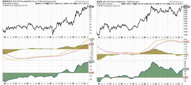
Both continue to show upward momentum. The momentum relative to Treasuries is at extreme levels. This suggests to me that, although this momentum may be sustained over the coming weeks, it is likely to reverse sooner rather than later as the downcycle makes itself felt more keenly.
Similar patterns are evident when we break down precious metals into their primary constituents.
Chart L. Gold momentum is high but slowing. (Stockcharts.com) Chart M. Platinum momentum had been less strong, but has spiked in recent weeks. (Stockcharts.com) Chart N. Silver, perhaps because of its affinity to industrial metals, has also been relatively subdued, but recently spiked. (Stockcharts.com)
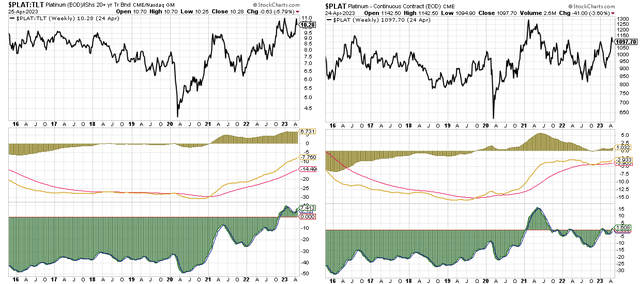
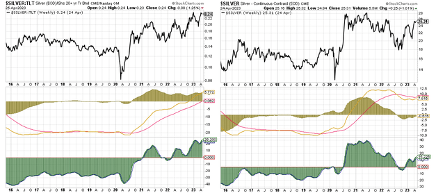
I think these markets are likely to break down relatively soon and that Treasuries are the likely primary beneficiaries.
Silver, being the closest precious metal to an industrial metal, is likely to perform the worst of the three in a continued downcycle, but I think the entire class is likely to weaken over the next year, especially relative to Treasuries.
Another hint that precious metals may be overextended is the relationship between gold and the ratio of industrial metals to bond yields. This relationship is illustrated below.
Chart O. Because of the nature of the market cycle, gold often tracks the ratio of industrial metals prices to long-term bond yields (World Bank; St Louis Fed)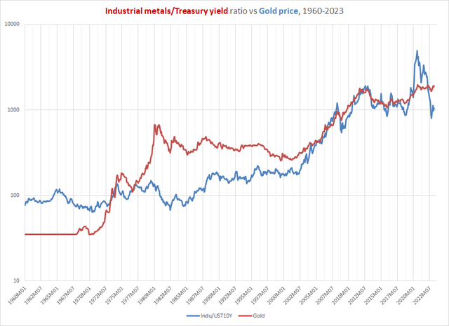
Because of the nature of the market cycle, where precious metals lead, industrial metals stand in the center, and yields slightly lag, there is a tendency for the industrial metals/gold ratio to correlate with bond yields. It turns out that, if we treat this like an equation (for example, indumetals/gold = yields), then we get a potential equation of gold = indumetals/yields. Since the price of gold stopped being suppressed beginning in the 1970s, there has been a closer alignment between the two sides of this equation. It suggests that it is possible that gold has not fallen enough in sympathy with the ratio of metals to yields.
In other words, perhaps more in line with traditional notions of the relationships between inflation, bond yields, and gold, the combination of rising yields and falling industrial metals prices should have caused more damage to gold prices than they have thus far.
Gold’s upside structural limits
One final note that points to limited upside potential for precious metals is the gold/copper and gold/oil ratios. As described earlier in the discussion about Gibson’s Paradox, precious metals, especially gold, have not clung to the earnings yield in the same way that other commodity classes have. They have shown a tendency to rise above what both the earnings yield and general commodities indexes might have otherwise suggested.
For example, the following is a chart of gold relative to grain prices.
Chart P. Gold has risen consistently relative to grains over the last 25 years. (World Bank)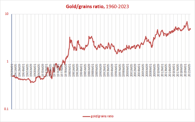
Gold has been moving relentlessly higher relative to grains for at least 25 years and perhaps longer.
But, there are some commodities outside the precious metals’ orbit that have been rangebound relative to gold, and that is copper and crude oil, illustrated in the following two charts.
Chart Q. The relationship between gold and copper seems to have stabilized by the late 1970s. (World Bank)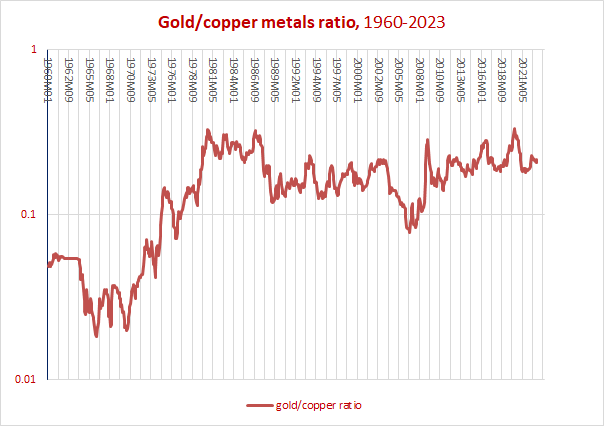
Since the suppression of gold prices concluded in the early 1970s, the gold/copper ratio has moved within a range. And the same is true for crude oil.
In the following chart, I have placed the gold/oil ratio alongside real commodity prices.
Chart R. The gold/oil ratio has almost always been rangebound and also seems to react to overall commodity conditions. (World Bank; St Louis Fed)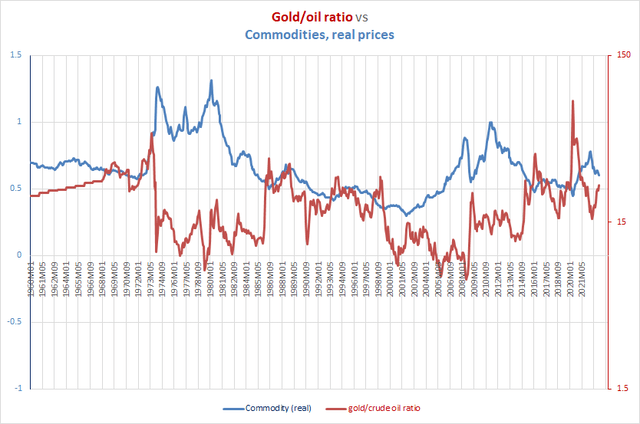
This chart tries to make two points. First, the gold/oil ratio has been rangebound for the last 60 years. Second, the behavior of the gold/oil ratio appears to be tied to commodity supercycles (and, as suggested in our discussion about Kondratiev and Schumpeter, to the earnings yield, global stability, innovation waves, etc.). The gold/oil ratio tends to remain below 15 or so during commodity supercycles and above 15 during the disinflationary supercycles.
The range in the gold/oil ratio has been quite wide historically. In fact, it set a new high only three years ago. And, according to the logic laid out earlier about relative performance in precious metals and other commodities during downcycles, we ought to expect the gold/oil ratio to continue rising, but this is more likely to be driven by falling crude oil prices than it is rising gold prices, and declining oil (and other commodity) prices are likely going to see falling yields.
To illustrate the point by way of a thought experiment: if we pencil in a gold/oil ratio of 36 (the 2016 peak, the second highest recorded), that would be about 40% higher than current levels (around 26). We could get there by crude oil going to $55/barrel or gold going to $2800/oz or some combination in between. To be clear, I am not targeting any of these prices or any particular level on the gold/oil ratio. My point is that in a downcycle, it is much easier for oil to do most of the heavy lifting.
Most of the great spikes in the gold/oil ratio (and most PM/commodity ratios generally) have occurred via commodity weakness rather than precious metals strength. It is very possible but unlikely that a continued downcycle would benefit precious metals very much, while it is much more likely that a continued downcycle would benefit long-term Treasuries.
Compared to long-term gold/commodity ratio ranges, gold is not at unprecedented highs, but it is at relatively high levels.
What would being wrong look like?
Because gold and precious metals are leading cyclical indicators, and because, over the long term, precious metals do not behave quite like other commodities, there are lots of ways to get precious metals wrong. The following is intended to be a brief rundown of the three primary ways this cyclical call on precious metals might be wrong.
First, if we are on the verge of a new commodity/earnings/inflation/yield cycle-that is, a market cycle-then it is likely that precious metals would rise, particularly relative to other commodities, in anticipation. Indeed, this is what happened in 2020: precious metals rallied even as everything else plunged. And, perhaps that explains the recent rally in precious metals.
Chart S. PMs generally anticipate market cycles, thus making them all the more difficult to predict. (Stockcharts.com)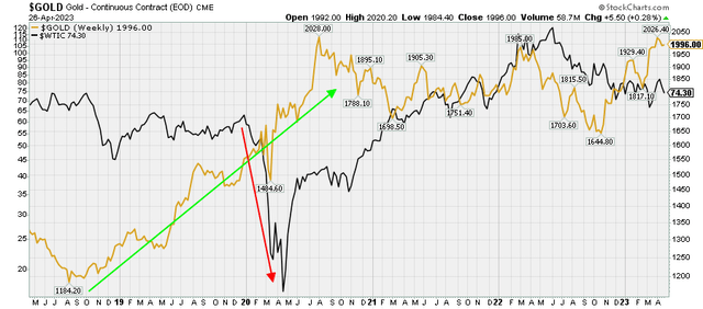
Second, if precious metals and gold in particular are no longer at all observant of the status of the earnings yield and other commodity prices, it is possible that they would drift up beyond their post-2008 highs (in gold’s case the $2000 area appears to be a key technical boundary).
Or, third, if the earnings yield and real commodity prices have already bottomed, then perhaps precious metals could continue to grind higher as yields and prices converged with gold, silver, and platinum levels. In this case, however, we would likely see incredible surges in energy prices-say, crude oil approaching $200/bl-because they tend to anticipate commodity and yield supercycles before precious metals (as illustrated in the gold/oil ratio chart earlier).
In other words, if a new inflationary cycle is on the near horizon or if whatever structural force has been drawing precious metals prices up faster than other commodities strengthens or if we are in a supercycle of rising yields and inflation, then any or all of these could negate much of what I have argued for here.
My primary point is that, although those risks exist, the majority of the risk is to the downside.
Conclusion
The best way to monitor this cyclical risk is to keep an eye on PM/Treasury bond ratios and their momentum. You do not need anything terribly fancy to do so. Basic technical tools such as those shown in the following gold/Treasury chart should be sufficient under such conditions.
Chart T. Relative momentum in gold and Treasuries is likely the key metric to watch and act on. (Stockcharts.com)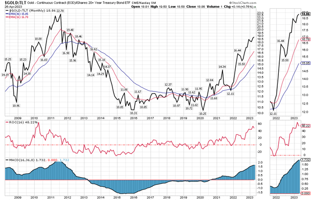
The signal that momentum has shifted has not yet materialized, but it is likely to do so in the relatively near future. Because of the cyclical nature of the risk, broad precious metals ETFs like the Invesco DB Precious Metals Fund (NYSEARCA:DBP) are likely to be exposed to the cyclical downside risk that silver is exposed to. DBP currently holds 80% gold and 20% silver futures, but it appears that all of the precious metals, including gold and platinum, are in ‘overbought’ territory, especially relative to long-term Treasuries.
As the downcycle continues, it is more likely for long-term Treasuries to benefit from this than are the precious metals. At the bare minimum, now does not seem to be an auspicious time to jump into precious metals, if you are not there already. Precious metals, as many have wisely argued, should form some portion of a well-balanced portfolio, but for those who trade precious metals, they likely have very limited upside potential and are likely to be beat by Treasuries over the remainder of the year and perhaps well into 2024.
Read the full article here