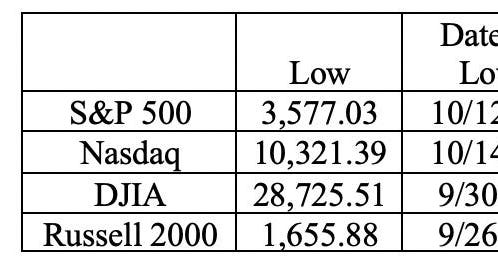
The equity markets closed the quarter and the first half of the year on a high note with some major indexes at interim highs. The table shows last fall’s market lows for the S&P 500, Nasdaq, the DJIA, and the Russell 2000, their levels at year’s end and for last Friday (June 30), and the percentage changes for those indexes from their lows to year’s end, to June 30 and year to date.
The DJIA, at 34,408 is still -5.5% below its January 5 ’22 all-time high (36,407). Nevertheless, it has rallied nearly 20% from its September 30 ’22 interim low. The S&P 500 closed on Friday at 4,450 and it has been on a tear for the past two weeks. However, it is still -7.2% below its 4,797 all-time high (January 3 ’22). Like the S&P, the Nasdaq, at 13,788, remains -10.3% below its 15,374 all time-high (September 7 ’21). Nevertheless, it too has been streaking for nearly all of June.
For some, this is evidence that a new “bull market” has begun. But we are skeptical. Like the dot-com bubble at the turn of the century, Nasdaq has been propelled by the AI-craze (Artificial Intelligence). And the S&P 500 is a capitalization weighted Index where the top seven stocks are responsible for most of this year’s gains. (The other 493+ stocks? Not much price growth!)
Note in the table that the DJIA recovered well in last year’s Q4 after its precipitous fall last September, and while it is up about 4% this year, that pales in comparison to the S&P and Nasdaq. Then there is the Russell 2000 which is an index of smaller capitalization stocks. At 1888.73 (the close on June 30), it is essentially unchanged from where it was on June 7th (1888.45) and is still -6.6% below its all-time 2021.35 peak (August 15, ’22).
So, it is clear that a few large cap stocks (tech oriented) are responsible for most of the outsized performance, as both the DJIA and Russell 2000 have lagged their tech laden S&P 500 and Nasdaq brethren.
We believe that the financial markets are ultimately tied to the economy and its health. Eventually, equity prices reflect what is going on in the economy. Yes, there are crazes; the current AI craze in the Nasdaq reminds us of the dot.com bubble a quarter century ago. Our recent blogs have pointed out growing economic weakness. Much of the past year’s economic performance came from “free money” programs and a moratorium on student loan debt payments. The former (“free money”) is in the rear-view mirror, while the latter (student debt moratorium) looks like it will end in September given the June 30 Supreme Court annulment of the Biden Administration’s student loan forgiveness program.
In Q1 reports, firm after firm either missed on revenues and/or earnings and key businesses guided lower. As an aside, we note that short positions on Tesla
TSLA
MSFT
AMZN
It’s the Economy (Stupid)!
The chart shows the Philly Fed’s Prices Received Diffusion Index. Note the 25-percentage point plummet over the past couple of months! Clearly, this is demand driven as supply chains have been healing.
The next chart shows the year over year percentage changes in the prices of existing and newly built homes. This is clearly a function of lower demand, as the supply of existing homes has contracted.
Note the recent steep recent price declines in the face of the existing home market’s low inventory levels. As we noted in past blogs, mortgage rates at 7% have made homeowners with current mortgages at 3% or lower “prisoners in their own homes,” as the mortgage payment, even for a sideways move, would rise significantly. For example, the payment on a $500,000 thirty-year fixed-rate 2.5% loan is about $1,975/month. That same $500,000 loan with a 7% rate jumps to $3,327/month, a 68% increase. $1,352/month ($16,224/year) is the difference, and it is substantial for most family budgets.
What the Fed Watches
The Fed’s favorite inflation index, the PCE (Personal Consumption Expenditure) Index showed a very mild +0.1% month over month increase in May (+1.2% annual rate) vs. +0.4% in April. On a year over year basis, the headline number here fell to +3.8%, the lowest reading since April ’21! Core Services Ex-Housing, a sub-index that Fed Chair Powell believes is quite important, showed up at +0.2% on a month over month basis in May (that’s a +2.4% annual rate). Still, from his recent testimony before the House and Senate, markets believe (80% probability) that the Fed will raise rates another +25 basis points (+0.25 percentage points) at its meeting in late July. Given the incoming inflation data and weakness now showing up in the economic data, this looks to us like overkill.
The left-hand side of the above chart shows the year over year change in used car prices, the original poster child for the recent spate of inflation. The right-hand side of the chart shows Zillow’s Rent Index (again on a year over year basis). Given that apartment construction is at a 40+ year high, our view is that the downdraft in rents continues. Shelter represents a 30% weight in the calculation of the CPI, so this is a very powerful deflationary force.
The next chart shows steep declines in the year over year rate of inflation in Medical Care Costs (left-chart) and Airline Fares (right-chart). Again, note the recent steep declines.
Good News From the Fed – an Oxymoron?
On Friday (June 30), there was, for a change, some good news from the Fed. The 23 largest U.S. banks all passed the Fed’s recession stress test, meaning their capital structure can withstand a significant Recession. But, that’s not the end of the story.
The Commercial Real Estate (CRE) market is some $6 trillion in size. Note that the light blue bars in the chart above show that the Regional and Community Banks own four times the CRE debt that the large banks hold. That’s about $2.4 trillion compared to $0.6 trillion at the large banks. We suspect a good portion of those banks wouldn’t pass the Fed’s Recession stress test. As discussed in past blogs, we’ve just seen large hotel owners in San Francisco walk away from their loans (Hyatt at Union Square and Parc55), and we understand that there are several more to come. Earlier in the year, we noted that some office buildings in NYC and LA had the same fate. The CRE issue is in its infancy.
Over the next two years, nearly half of U.S. public and private debt is set to mature and needs to be refinanced. This looks like it will occur with rates at least 300 basis points (3 percentage points) higher. Talk about a drain on cashflow for businesses and a strain on banks when their CRE portfolios turn to junk.
Other Incoming Data
In Canada, industrial payrolls fell -140K in April along with a decline of -0.3% in the workweek. That’s a humongous number given that Canada’s population (40 million) is about one-eighth the size of the U.S. That is equivalent to the loss of -1.1 million industrial jobs in a month in the U.S. Imagine what would happen to the financial markets if such a number occurred. Also note that many economists believe that Canada is just a mini-version of its southern neighbor.
The rest of the developed world is also slowing. China’s manufacturing sector has been contracting for the past three months with their Purchasing Managers’ Index (PMI) now < 50, the demarcation line between expansion and contraction. Retail sales in Germany are -5.1% lower on a year over year basis while their May unemployment rate rose to 5.7% (from 5.6%).
On Friday, the Department of Commerce released its third (and final) Q1 GDP revision. According to the release, Q1 Real GDP rose at a +2.0% annual rate, up from the +1.3% in the last GDP update. Almost all the rise was due to an “improvement” in net exports, as without that “improvement,” real GDP growth would have been +1.4%. That “improvement” occurred because imports fell further and faster than exports. Ask yourself how strong the U.S. economy can be when imports are falling! It is clear from the monthly data that the early months of the year were stronger, and there has been a deterioration as the year has progressed.
Final Thoughts
- The latest report for Real U.S. Retail Sales shows that they are at the same level they were in August, 2021.
- Despite a lack of inventory in the existing home market driving buyers to the new home market, housing starts have been flat for two years. And we note the fall in the median prices of new and existing homes.
- Weekly earnings have barely kept up with inflation and workweek hours continue to fall as business owners cling to those hard-to-find workers; fewer hours instead of layoffs.
- Industrial Production in the U.S. has been stagnant for almost two years, and the Leading Economic Indicators (LEI) have been negative now for 14 months in a row. At this many negative months in a row, this indicator has a 100% Recession predicting track record.
History proves that financial markets eventually mimic the state of the economy. We close by reminding our readers of a couple of legendary analyst Bob Farrell’s 10 Rules for Investors:
Rule 4: Exponential rapidly rising or falling markets usually go farther than you think, but they do not correct by going sideways.
Rule 7: Markets are strongest when they are broad and weakest when they narrow to a handful of blue-chip names.
(Joshua Barone and Eugene Hoover contributed to this blog.)
Read the full article here